
Big data visualization represents large data sets through visual tools like pie charts, heat maps, and bar charts. Analyzing vast data sets and conveying insights to non-experts can be challenging. Visualization addresses this by transforming complex data into easy-to-understand charts or infographics, allowing decision-makers to grasp key points quickly. Clear, visual representations ensure no data is overlooked, facilitating informed decision-making. Effective data visualization is crucial for companies to analyze raw data efficiently and keep all stakeholders aligned.
Charts: Charts are among the most prevalent forms of data visualization, allowing users to compare and analyze data points effectively. Here are some common chart types:
Line Charts: Line charts are ideal for displaying trends over time. They plot data points on a graph and connect them with lines, making it easy to visualize changes and patterns across time intervals. This type of chart is particularly useful for financial data, sales figures, or any continuous variable.
Bar Charts: Bar charts represent categorical data with rectangular bars. The length of each bar corresponds to the value it represents, allowing for straightforward comparisons between different categories. Bar charts can be oriented vertically or horizontally and are effective for showing changes in values over time or comparing different groups.
Pie Charts: Pie charts display data as slices of a circle, illustrating the proportion of each category relative to the whole. While they can effectively show parts of a whole, pie charts become less effective when there are many categories or when the differences between values are minimal.
Donut Charts: Similar to pie charts, donut charts have a hole in the center, allowing for additional information to be displayed within that space. They provide a cleaner look while still conveying similar information about proportions.
Plots: Plots help visualize relationships between variables in two or three dimensions:
Scatter Plots: Scatter plots display individual data points on a two-dimensional graph, showing the relationship between two variables. Each point represents an observation, making it easier to identify correlations or trends within the dataset.
Bubble Charts: A variation of scatter plots, bubble charts add a third dimension by varying the size of the bubbles according to another variable. This allows for more complex data representation and can highlight significant trends.
Histograms: Histograms represent the distribution of numerical data by dividing it into bins or intervals. They show how many observations fall into each bin, providing insights into the frequency distribution of the dataset.
Maps: Geographical maps provide spatial context to data points:
Heat Maps: Heat maps use color gradients to represent the density or intensity of data points in specific areas. They are particularly useful for visualizing geographical trends, such as population density or sales performance across regions.
Dot Distribution Maps: These maps use dots to represent individual data points across a geographical area. They can effectively illustrate patterns and distributions within specific locations.
Choropleth Maps: Choropleth maps use color shading to represent statistical values across predefined regions (like countries or states). This type of map is useful for visualizing demographic information or election results.
Advanced Visualization Techniques: As big data continues to evolve, so do visualization techniques:
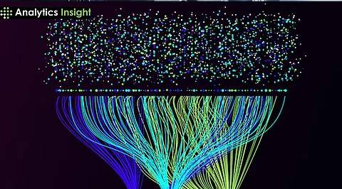
Network Diagrams: Network diagrams illustrate relationships between entities (nodes) using connecting lines (edges). This method is effective for visualizing social networks, communication patterns, or any interconnected systems.
Treemaps: Treemaps display hierarchical data as nested rectangles, where each rectangle's size is proportional to its value. This method is useful for visualizing large datasets with multiple categories and subcategories efficiently.
Word Clouds: Word clouds visually represent text data by displaying words in varying sizes based on their frequency within the dataset. This technique is often used in sentiment analysis or content analysis.
Dashboards: Dashboards aggregate multiple visualizations into a single interface, providing an overview of key metrics and performance indicators at a glance. They allow users to interact with various visual elements dynamically.
Simplification of Complex Data: One of the primary benefits of big data visualization is its ability to simplify complex datasets. Raw data can often be overwhelming and difficult to interpret, especially when dealing with large volumes. Visualization transforms this data into graphical formats—such as charts, graphs, and maps—that are easier to understand. This simplification allows stakeholders to quickly grasp essential information without getting bogged down by numbers and statistics, thereby enhancing data comprehension across the organization.
Identification of Patterns and Trends: Data visualization plays a vital role in revealing patterns, correlations, and trends that may not be immediately apparent in raw data. By using visual representations, analysts can quickly identify outliers and significant trends within the dataset. This capability is crucial for timely decision-making, as recognizing these patterns can lead to faster insights and actions that save time and resources. For instance, businesses can track sales trends over time or monitor customer behavior patterns effectively through visual tools.
Enhanced Decision-Making: Effective data visualization significantly enhances the decision-making process. When data is presented visually, decision-makers can quickly understand key insights and make informed choices based on accurate information. This rapid comprehension can provide organizations with a competitive edge in their respective markets. The ability to visualize KPIs (Key Performance Indicators) in real-time allows leaders to respond promptly to changing conditions and make strategic adjustments as necessary.
Improved Communication: Visualization serves as a powerful communication tool within organizations. It allows teams to present complex ideas and findings in an accessible manner that resonates with both technical and non-technical stakeholders. By using visual formats, teams can foster better collaboration and understanding across departments, leading to more cohesive strategies and initiatives. Effective communication of insights derived from big data helps align teams around common goals and objectives.
Real-Time Monitoring: In an era where data is constantly generated, real-time monitoring through visualization tools has become increasingly important. Many businesses utilize interactive dashboards that display live data updates on various metrics. This capability enables organizations to identify trends, anomalies, or emerging patterns as they occur, allowing for prompt action and response . For example, a retail company can monitor inventory levels in real-time to prevent stockouts or overstock situations.
Enhanced Data Understanding: Visual representations of data facilitate a deeper understanding of relationships and dependencies within datasets. By placing multiple datasets on one chart or map, analysts can uncover hidden correlations that would otherwise remain unnoticed in tabular formats . This insight is invaluable for identifying factors that influence performance or outcomes, enabling organizations to make more informed strategic decisions.
Increased Accessibility: Data visualization democratizes access to information by making it more understandable for individuals at all skill levels—beyond just data scientists or analysts. User-friendly visualization tools allow employees from various departments to engage with the data directly, fostering a culture of data-driven decision-making throughout the organization . This increased accessibility empowers teams to leverage insights without relying solely on specialized personnel.
Predictive Analysis: Visualization tools are also instrumental in predictive analytics by effectively representing forecasted trends and potential outcomes based on historical data. Organizations can use visualizations to identify future opportunities or risks, allowing them to plan strategically for various scenarios. This foresight is critical for maintaining competitiveness in rapidly changing markets.
In the healthcare sector, data visualization is instrumental in monitoring patient outcomes, tracking disease outbreaks, and optimizing resource allocation. For example:
Disease Tracking: Health organizations utilize heat maps to visualize the spread of contagious diseases, allowing them to identify hotspots and allocate resources effectively.
Patient Outcomes: Dashboards that display patient data over time can help healthcare providers analyze treatment effectiveness and improve patient care.
Financial institutions leverage big data visualization to gain insights into market trends, manage risks, and detect fraudulent activities. Key applications include:
Market Trends: Interactive dashboards allow analysts to visualize stock performance and market fluctuations in real-time, enabling timely investment decisions.
Fraud Detection: Scatter plots can illustrate relationships between transaction variables, helping to identify anomalies that may indicate fraudulent activities.
In the retail industry, data visualization helps businesses understand customer behavior and optimize inventory management. Notable use cases include:
Customer Insights: Retailers can analyze purchasing patterns through bar charts and line graphs, allowing them to tailor marketing campaigns and improve customer engagement.
Sales Performance: Heat maps can visualize sales data across different regions or stores, helping management identify high-performing areas and adjust strategies accordingly.
Manufacturing firms use data visualization to enhance operational efficiency and reduce costs. Examples include:
Production Monitoring: Real-time dashboards display production metrics, enabling managers to identify bottlenecks and optimize workflows.
Predictive Maintenance: Visualizing machine performance data helps predict maintenance needs before equipment failures occur, reducing downtime and maintenance costs.
Telecom companies harness big data visualization for network optimization and customer experience enhancement. Key applications are:
Network Performance: Visualizations of network traffic patterns help identify congestion points and optimize bandwidth allocation.
Customer Analytics: By analyzing customer usage patterns through visual dashboards, telecom companies can develop personalized plans that improve customer satisfaction.
Governments utilize big data visualization to enhance transparency and inform policy-making. Important use cases include:
Public Policy Analysis: Visualizing budget allocations through pie charts or bar graphs allows citizens to understand government spending priorities.
Crime Statistics: Heat maps can illustrate crime rates in different neighborhoods, aiding law enforcement in resource allocation and community safety initiatives.
In educational settings, data visualization supports learning by making complex information more accessible. Examples include:
Student Performance Tracking: Dashboards that visualize student grades over time help educators identify at-risk students and tailor interventions accordingly.
Curriculum Effectiveness: Visualization tools can analyze course completion rates and student feedback, providing insights into curriculum improvements.
The energy industry uses big data visualization for resource management and efficiency improvements. Key applications include:
Consumption Patterns: Visualizing energy consumption data helps utility companies identify peak usage times and promote energy-saving initiatives.
Renewable Energy Monitoring: Dashboards track the performance of renewable energy sources (like solar panels), enabling better integration into the energy grid.
Marketing teams leverage big data visualization to analyze campaign performance and customer engagement metrics. Notable use cases include:
Campaign Analysis: Line charts can track website traffic or conversion rates over time, helping marketers assess the effectiveness of their campaigns.
Social Media Analytics: Visualizing engagement metrics (likes, shares) through bar charts allows marketers to understand audience preferences and adjust strategies accordingly.
In sports, data visualization is used extensively for performance analysis and strategy development. Examples include:
Player Performance Tracking: Coaches use scatter plots to analyze player statistics during games, identifying strengths and weaknesses.
Game Strategy Visualization: Heat maps can illustrate player movements on the field or court, helping coaches devise effective game plans.
Big data visualization is vital for several reasons:
Simplifies Complex Data: It helps in breaking down large datasets into understandable visuals, making it easier for stakeholders to grasp key insights.
Facilitates Quick Decision-Making: Visual representations allow decision-makers to quickly interpret information and make informed choices based on real-time analytics.
Enhances Communication: Visualization aids in communicating complex information clearly to diverse audiences, including those without technical expertise.
Identifies Patterns and Trends: It enables users to spot trends and anomalies within the data that may not be visible in traditional tabular formats.
There are various types of visualizations used in big data analysis, including:
Charts: Line charts, bar charts, pie charts, and histograms are commonly used to represent quantitative data.
Maps: Heat maps and choropleth maps visualize geographical data and patterns.
Graphs: Scatter plots and network diagrams illustrate relationships between variables or entities.
Dashboards: Interactive dashboards consolidate multiple visualizations into a single interface for comprehensive monitoring.
Several tools are popular for big data visualization, each with unique features:
Tableau: Known for its powerful visualization capabilities and user-friendly interface.
Microsoft Power BI: Offers robust analytics features and integrates well with other Microsoft products.
Google Charts: A beginner-friendly tool that provides customizable chart options without extensive coding knowledge.
D3.js: A JavaScript library that allows for highly customizable visualizations but requires coding skills.
By presenting critical insights in a clear visual format, big data visualization enables decision-makers to:
Quickly comprehend vast amounts of information.
Identify key performance indicators (KPIs) at a glance.
Analyze trends over time to inform strategic planning.
Compare different datasets or variables effectively.
To create impactful visualizations, consider the following best practices:
Know Your Audience: Tailor your visualizations based on the audience's expertise and needs.
Choose the Right Visualization Type: Select appropriate visualization techniques based on the data type and the insights you wish to convey (e.g., use line charts for trends over time).
Keep It Simple: Avoid cluttering visuals with excessive information; focus on key insights.
Use Color Wisely: Utilize color schemes that enhance readability and comprehension without overwhelming the viewer.
Iterate and Refine: Continuously seek feedback on your visualizations and refine them based on user input.
Some challenges include:
Data Quality: Poor quality or incomplete data can lead to misleading visualizations.
Complexity of Data: Large datasets may contain numerous variables, making it difficult to choose the right visualization method.
Scalability Issues: As datasets grow, ensuring that visualizations remain responsive and informative can be challenging.