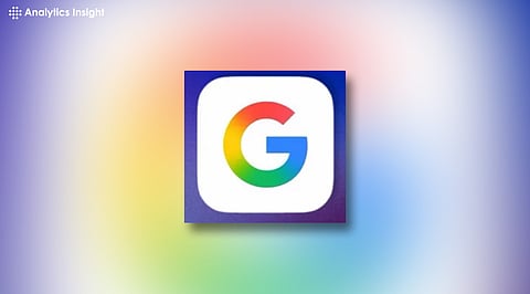

Google has rolled out a redesigned ‘G’ icon, replacing its solid color blocks with a smooth gradient. This subtle visual shift reflects a bolder strategy, signaling the tech giant’s deeper integration of AI and a unified design vision across platforms.
Google recently unveiled a new look for its iconic ‘G’ logo, the first major update since 2015. At first glance, the redesign might seem minimal. The signature four colors, blue, red, yellow, and green, remain. But a closer look reveals a more fluid, gradient design that signals more than just a visual refresh.
This subtle shift points to deeper changes in Google’s branding, strategy, and identity as the company continues its pivot towards AI-powered products.
The previous ‘G’ logo was bold, plain, and color-blocked. It was built for a digital-first era, where it would be comfortable on apps, search bars, and browser tabs. The new one retains the basic shape but mingles the four colors into a smooth gradient.
The move from flat to fluid is not only a stylistic adjustment, it is based on current design tendencies towards softness, movement, and coherence.
More significantly, it indicates Google’s changing strategy for user experience. The firm is now concentrating on making more intuitive, personalized interactions across its platforms. A gradient logo represents fluidity, implying a smoother link between users and Google’s expanding array of services.
The update to the design follows Google’s increasing focus on artificial intelligence. Its AI-powered assistant, Gemini, has been at the forefront of the development. The branding for Gemini already incorporates gradient colors and rounded imagery. The new ‘G’ now continues this, visually associating the company’s main identity with its AI aspirations.
In effect, this is a branding consolidation plan. By overlaying the Google logo on the look and feel of Gemini, the firm is signaling a clear message: AI is now at the center of what Google does. The gradient communicates change, an appropriate metaphor for machine learning, which continuously evolves and adapts.
This logo update comes alongside the launch of Material You 3, Google’s new design system. Material You is focused on user personalization, dynamic color schemes, and a more expressive user interface. The new ‘G’ logo sits perfectly within this environment. It’s not just about appearance but about how it feels when in use.
Google is all about strategic timing. Rolling out a logo update now serves to link its multiple visual and product overhauls into one cohesive thread. It’s not just branding; it’s an attempt to visually set up users for deeper alterations in the way they’ll engage with Google products.
As with most logo redesigns, user reactions online have been divided. Some like the softer, more contemporary look. Others hardly even notice the change or wonder why the change was necessary in the first place. But that’s the nature of stealth design updates; they’re not designed to be jarring, but to improve the brand gradually.
Notably, this type of incremental change keeps the brand familiar while advancing the company. Radical redesigns have the potential to alienate users. These kinds of gentle changes like this one tread the fine line between remaining relevant and remaining familiar.
For the moment, the gradient ‘G’ can be seen only in some Google apps on iOS and Pixel devices. But it is probably just the tip of the iceberg. A wider release is coming, with other apps such as Gmail, Chrome, and Maps also possibly seeing similar visual shifts. It points toward Google adopting a more coherent, AI-driven visual style across its entire system.
The shift also heralds the fact that design will have an increasing influence on how users interact with Google’s services. With artificial intelligence becoming more entrenched in search, productivity applications, and even devices, how users interact with these products will become more important than ever.
Google’s new ‘G’ logo might appear insignificant, but it is a definite direction. It’s a subtle but assertive move toward an AI future. The color combination isn’t merely fashionable, it symbolizes change, unification, and movement.
In an era where branding and technology are inseparable, even minute shifts such as this one can signal fundamental changes in a company’s priorities. In Google’s case, the gradient ‘G’ is not just a fancy logo; it’s a harbinger of what’s on the horizon.
