
Picture packed stadium, thousands of fans holding their breath as a crucial penalty is about to be taken. The tension is unbearable. But wait, somewhere in the quiet corners of the internet, data scientists, armed with algorithms and caffeine, have already crunched the numbers.
The goalkeeper’s dive direction? Predicted. The shooter’s accuracy under pressure? Calculated. And for the savvy bettors on RajBet, this isn't just a game - it's an opportunity.
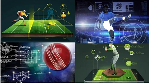
From betting markets to coaching strategies, modern sports are less about intuition and more about cold, hard data.
But let’s be real: without charts, heatmaps, and dashboards, even the best stats look like an ancient riddle. Let’s explore how data visualization is turning sports predictions into an art form.
One of the biggest advantages of data visualization in sports predictions? It finally allows us to stop relying on gut feelings and questionable “expert” opinions. Instead of listening to that one uncle who just knows which team will win, we can now rely on actual trends backed by data.
Whether it’s tracking a football team’s performance across a season or analyzing a tennis player’s serve accuracy under different conditions, time-series graphs make it easy to detect patterns that raw numbers alone might hide.
For example, let’s consider a football team's scoring performance over the past ten matches. A simple spreadsheet of numbers would make it difficult to see fluctuations, but a well-designed line graph can reveal:
Slumps and peaks in scoring output
Impact of player injuries on offensive performance
How home vs. away games affect scoring consistency
Here are examples of time-series data on goals scored per match:
Now, imagine seeing this as a line graph—suddenly, it’s painfully obvious that the team turns into a shadow of itself whenever their star player isn’t on the field. If you were placing bets on RajBet, would you really back this team when their best player is out injured? Probably not.
There’s even a name for this phenomenon: the "Ewing Theory"—the idea that teams often underperform without their key players, even if they look strong on paper. By plotting match results on a time-series graph, analysts can watch performance levels crash and burn in real time.
Also, who among us doesn't like a solid graph that backs up our suspicions? Whether you’re a coach, a bettor, or just someone who enjoys proving people wrong with data, time-series visualizations are a game-changer.
Ah, numbers. So much potential, yet so little clarity, until you slap them onto a heatmap and suddenly, they make sense. Nobody has the time or patience to sift through endless spreadsheets of player statistics when a simple color-coded chart can tell the whole story in seconds.
In sports like basketball, soccer, and even baseball, heatmaps have become the go-to tool for analyzing player movements, shooting accuracy, and defensive positioning. They reveal things even the sharpest eyes might miss. Like why a supposedly elite shooter suddenly turns into a lost tourist every time he steps outside his favorite shooting zone.
Let’s discuss some important ways heatmaps are used in sports prediction:
Soccer: Tracking which areas of the pitch a player is most active in.
Basketball: Analyzing a player's shooting efficiency from different zones. Great for confirming that, yes, someone really shouldn’t be taking those three-pointers).
Tennis: Mapping where a player’s serves are most effective.
American Football: Understanding quarterback passing.
How does this work in practice? Let’s take a basketball player who shoots from everywhere, even when half of his attempts seem like gifts to the defense. A simple shooting percentage won’t say much, but a heatmap tells the harsh truth: some zones are gold mines, others—total disasters.
This player should probably stop taking corner threes unless he enjoys watching bricks fly. Meanwhile, his top-of-the-key accuracy makes him a perfect pick-and-roll shooter. Heatmaps of PSG’s Thiago Silva and Presnel Kimpembe in the UEFA Champions League showed their defensive dominance, exposing where opponents struggled.
The best part of sports rivalry is watching the supporters bicker all day long until the numbers finally put a stop to it. With a well-placed graph, there's no need to argue over who's better. Before major matches, analysts dive into head-to-head stats, but visualizing them makes it painfully obvious who has the upper hand.
Take Liverpool vs. Manchester United, one of football’s most heated rivalries. Numbers alone don’t tell the full story, but a side-by-side comparison? That’s where the truth comes out.
Liverpool dominates in attack, defense, and ball control. Meanwhile, United seems to enjoy making things interesting by conceding more than they score. A heatmap of Liverpool’s goals would likely show their midfield feeding the attack with ease, while United scrambles to plug defensive gaps.
A perfect example? Their 2-2 draw on January 5, 2025—Liverpool clawed back with goals from Gakpo and Salah, while United’s lead slipped faster than their fanbase’s patience. Next time someone insists stats don’t matter, just smile, pull up a graph, and enjoy the silence.
Sports predictions have come a long way from being just lucky guesses—sorry to all those self-proclaimed experts relying on gut feelings. Data visualization takes those complicated stats and makes them super clear and easy to understand.
Line graphs can spot slumps before fans start to worry, heatmaps reveal weaknesses that players would prefer to keep under wraps, and charts can put an end to bar debates in no time. Looking for an advantage? Numbers are honest—unlike your buddy's so-called sure bets.