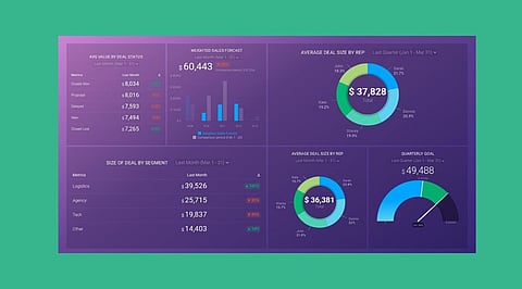
.png)

Use AI tools to clean Excel data, identify errors, and prepare datasets for analysis.
Generate formulas, select meaningful KPIs, and create charts that highlight important business trends.
Build interactive dashboards with PivotTables, slicers, and timelines, while verifying calculations before sharing results.
Building an Excel dashboard used to mean knowing your way around formulas, charts, PivotTables, and formatting. AI tools like ChatGPT and Microsoft Copilot have changed that. Beginners can now analyze data, generate formulas, spot trends, and organize information without years of Excel experience.
But AI doesn’t replace good data or your own judgment. A dashboard is only useful if the data behind it is accurate, the metrics are well chosen, and the calculations are checked. Used carefully, AI makes spreadsheet work easier while you stay in control of the results.
You can start with either Microsoft Copilot or ChatGPT.
Copilot works inside Excel and can help with formulas, charts, PivotTables, and data insights. Whether you have it depends on your Microsoft 365 plan and settings.
ChatGPT works differently. You upload an Excel or CSV file, ask questions in plain English, get formulas explained, and explore your data before building anything. The features you get depend on your plan and workspace.
You don’t need both. Excel plus one assistant is enough to get started.
A dashboard can only be as reliable as its data, so get your dataset into a consistent table before you create any charts.
Take a sales dataset with Date, Product, Region, Units Sold, and Revenue. Give every column a clear heading and keep dates, quantities, and currency values in one format each. Blank rows, duplicates, and merged cells tend to cause trouble, so remove them. Then press Ctrl + T to turn the range into an Excel Table. That way, formulas that reference the table pick up new rows automatically.
AI can flag missing values, mixed date formats, wrong data types, and odd entries. Still, review every suggested fix before accepting it. Two records that look like duplicates may be separate, genuine transactions.
Next, decide what the dashboard should tell its reader.
A simple sales dashboard might track total revenue, total units sold, covered regions, and average revenue per unit. With sample data showing Rs 7,00,000 in revenue across 28 units, average revenue comes to Rs 25,000 per unit. Don’t mistake that for profit per unit, though. They’re different things.
AI can suggest KPIs, explain what each one measures, and write the Excel formulas for you. Basic functions like SUM and ROWS handle totals and counts, and structured references keep your calculations tied to the source table.
What you track depends on the dashboard’s purpose. A marketing team cares more about clicks, conversions, and cost per lead than about sales volume.
Also Read: Google Expands Tools to Identify AI-Generated Content
Charts make trends visible that raw figures hide. A line chart shows revenue over time, a bar chart compares regions, and a column chart shows how products stack up.
AI can recommend chart types, point you to the right data fields, and suggest axis labels. You can then build the charts through Excel’s Insert menu or through Copilot.
Don’t fill the dashboard with charts for the sake of it. Each one should answer a specific question: Is revenue going up? Which region earns the most? Which product needs attention?
Create a worksheet named Dashboard and bring your KPIs and charts onto it. Put the most important KPIs at the top so they’re the first thing people see.
Keep fonts, colors, number formats, and chart names consistent. Skip the heavy gridlines and decoration.
For deeper analysis, add PivotTables and PivotCharts, along with slicers for fields like Region, Product, and Date. Connect the slicers to the relevant PivotTables, and the charts will filter without you rebuilding anything.
Also Read: Meet Google’s New Gemini Coworker Built to Handle Workplace Tasks
Check everything AI produces before you share the dashboard. Compare totals against your original data, spot-check transactions and categories, test the filters, and make sure formulas still work after you add new rows. If the source data changes, refresh your PivotTables.
AI can save you a lot of time on spreadsheet tasks, but it can’t check its own work for you. For beginners, the best approach is clean data, meaningful metrics, and careful verification.
Follow that, and you can build dashboards for sales, marketing, websites, projects, or overall business performance without memorizing every Excel formula first.
1. How Can Beginners Build An Excel Dashboard With AI?
Beginners can use ChatGPT or Microsoft Copilot to clean data, generate formulas, create charts, calculate KPIs, and organize dashboard elements.
2. Which AI Tools Help Create Excel Dashboards?
Microsoft Copilot helps in supported Excel environments, while ChatGPT analyzes uploaded spreadsheets, explains formulas, identifies trends, and recommends visualizations.
3. Can ChatGPT Generate Excel Formulas Automatically?
Yes, ChatGPT can suggest Excel formulas for totals, averages, percentages, and other calculations, but users should verify results before implementation.
4. How Can Users Make Excel Dashboards Interactive?
Users can create PivotTables, PivotCharts, slicers, and timelines to filter information by categories, regions, products, and reporting periods.
5. Why Should Excel Dashboard Calculations Be Verified?
AI-generated formulas may contain errors or incorrect assumptions. Comparing totals with source data helps ensure accuracy before sharing dashboard insights or making decisions.
