
Do you want to present information in a way that's visually appealing and easy to understand?
Infographics and data visualizations are what you need. These tools can help you turn complex data into a clear, concise, and visually appealing format. And the good news is you don't need to be a graphic design expert to create them.
In fact, you can use a tool you probably already have on your computer: PowerPoint. What is the use of PowerPoint in data visualization? This blog post will show you how to use PowerPoint to create stunning infographics and data visualizations.
Getting started with PowerPoint is easier than you might think. Here are some tips to help you create impressive infographics and data visualizations:
1. Choose a design: PowerPoint offers a range of templates and designs you can use as a starting point for your infographic or data visualization. Look for one that matches the tone and content of your message.
2. Select and format data: Make sure your data is accurate and relevant. Use headings and subheadings to break down the information into digestible chunks. Consider using charts and graphs to visually represent the data.
3. Insert and edit charts and graphs: PowerPoint has various built-in chart and graph options, so choose the one that best suits your needs. You can customize colors, fonts, and other elements to match your design.
4. Add images and icons: Visuals are essential to any infographic or data visualization. PowerPoint allows you to insert images and icons that can help convey your message more effectively.
5. Use PowerPoint plugins for data visualization: PowerPoint has several plugins to help you create more complex and dynamic data visualizations. Look for plugins that offer interactive elements or allow you to embed live data feeds.
Creating infographics is not just about throwing data onto a page and hoping for the best. You must carefully consider the infographic design and layout to properly present your information. Here are some helpful data visualization techniques:
1. Keep it simple and easy to understand: Don't overload your infographic with too much information. Stick to the most important data and present it in an easily understandable way.
2. Use appropriate colors and fonts: Choose colors that complement each other and are easy on the eyes. Use a maximum of three readable fonts throughout your infographic.
3. Incorporate visual hierarchy and organization: Use visual cues such as headings, subheadings, and bullet points to help guide the reader's eye through your infographic slide.
4. Use visual cues to highlight vital information: Use icons, charts, and graphs to emphasize key points and make your data more memorable.
5. Consider the target audience: Consider who your audience is and what interests them. Tailor your infographic to their needs and preferences.
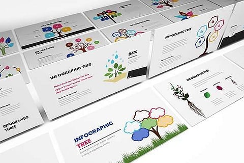
Here are examples of infographics and data visualization you can create using PowerPoint:
You can use PowerPoint to create compelling visualizations of sales data. For instance, a line graph can show the sales trend over time, while a pie chart can highlight the percentage of sales for different products. With the right colors, icons, images, and fonts, you can create a sales data visualization that tells a story at a glance.
PowerPoint can be a great tool to use if you're trying to present social media analytics. You can create an infographic that showcases social media metrics like engagement rates, follower growth, and top-performing content. Using a mixture of charts, icons, and text boxes, you can create an eye-catching infographic you can share on social media or during PowerPoint presentations.
PowerPoint is perfect for creating comparison infographics, which you can use to showcase the differences between two or more things. For example, you can use a side-by-side chart to compare the features of different products or a bar graph to show the cost savings of different solutions. Use contrasting colors and fonts to make your infographic stand out and emphasize the key points of your comparison.
Flowcharts are an effective way to show a process or workflow. You can create a process flowchart infographic in PowerPoint to break down complex information into easy-to-understand steps. With visual elements like shapes, arrows, and icons, you can create a flowchart representing a process and guiding the viewer through each step.
Timeline infographics are visual representations of chronological events presented linearly along a horizontal or vertical line. They are often used to display historical, biographical, or project-related information clearly and concisely. Timeline infographics can include text, images, and other graphic elements to help communicate complex information.
PowerPoint is a versatile tool offering various advantages for creating infographics and data visualizations. Here are some reasons why PowerPoint is a great choice:
Wide availability: PowerPoint is a widely-used program available on most computers. So it is easily accessible.
User-friendly interface: PowerPoint is intuitive and user-friendly, with drag-and-drop functionality and simple formatting options.
Pre-designed presentation templates: The software offers a wide range of templates for creating infographics and data visualization. PowerPoint infographic templates can save you time and effort when preparing your PowerPoint presentation.
Easy to modify and update: One of the best things about PowerPoint is that it makes it easy to make changes and updates. You can quickly edit text, add or remove elements, and adjust the layout to suit your needs.
Compatibility with other Microsoft Office tools: You can seamlessly integrate PowerPoint with other Microsoft Office tools like Excel or Word. This makes it easier to import data and other content.
PowerPoint is a great tool for the visual representation of information. Following the tips and examples outlined in this post will help you create stunning and effective infographics. So why not give it a try? Start using PowerPoint to create infographics and data visualizations today and see the results!
Join our WhatsApp Channel to get the latest news, exclusives and videos on WhatsApp
_____________
Disclaimer: Analytics Insight does not provide financial advice or guidance on cryptocurrencies and stocks. Also note that the cryptocurrencies mentioned/listed on the website could potentially be scams, i.e. designed to induce you to invest financial resources that may be lost forever and not be recoverable once investments are made. This article is provided for informational purposes and does not constitute investment advice. You are responsible for conducting your own research (DYOR) before making any investments. Read more here.