
Beyond the Price Chart: A Deeper Look at Market Dynamics
The Order Book Unveiled
Mapping the Invisible: What Heatmaps Reveal
Identifying Liquidity and Key Levels
Understanding Bid and Ask Walls
The Psychology of Liquidity
Heatmaps and Order Flow Analysis
Building a Strategy with Liquidity in Mind
From Static to Dynamic: The Real-Time Advantage
The Unmissable Edge
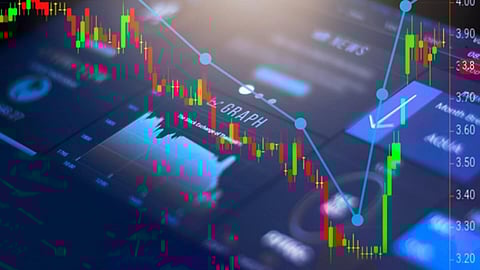
For decades, the price chart has been the primary tool for traders. Lines, bars, and candlesticks have told the story of price movement, and a multitude of technical indicators have attempted to predict its future. However, this approach often presents a simplified view, a two-dimensional snapshot of a far more complex and dynamic environment. The price chart shows us where the market has been, and where it is now, but it offers little insight into the forces that are driving that movement. It's akin to watching the surface of a pond without understanding the currents and eddies swirling beneath. To truly gain an edge, traders must look beyond the surface and into the heart of the market’s mechanics. This is where the order book, and specifically a visual representation of it, becomes an indispensable tool. It provides a window into the raw supply and demand that dictates price, offering a level of transparency and insight that traditional charts simply cannot match.
While a conventional price chart will show you a price moving from $100 to $105, it doesn't reveal the struggle, the accumulation of orders, or the aggressive buying and selling that made that move happen. The real action occurs in the order book, where buyers and sellers place their bids and offers. This is the unvarnished truth of the market. And for a long time, the order book was a complex, difficult-to-interpret stream of text and numbers. However, with modern stock heatmap tools like Bookmap, this data is transformed into an intuitive, visual representation—a heatmap. The heatmap makes the invisible visible, mapping out the depth and concentration of orders in a way that is immediately understandable. It is the evolution of market analysis, taking us from a reactive to a proactive state of trading.
At its core, the order book is a list of all buy and sell orders for a specific financial instrument at various price levels. Bids are the orders to buy, and they are typically listed below the current market price. As the price moves down, these bids are filled. Offers, or asks, are the orders to sell, and they are listed above the current market price. As the price moves up, these offers are filled. The current market price is the point at which the highest bid and the lowest offer meet. The order book is in a constant state of flux, with orders being placed, modified, and cancelled in a fraction of a second. This makes the traditional, text-based view of the order book a challenging and often overwhelming tool to interpret in real-time.
A heatmap elegantly solves this problem. It takes the depth of the order book at each price level and visualises it as a range of colours. Typically, the denser the concentration of orders at a specific price, the brighter or more intense the colour. This allows traders to instantly spot areas of high liquidity—large clusters of buy or sell orders that represent significant supply and demand zones. These zones are not random; they are often strategically placed by large institutions, and understanding where they are located is a critical piece of the trading puzzle. The heatmap transforms the chaotic stream of data into a coherent and understandable landscape, making it the best option for traders looking to quickly grasp market structure.
A heatmap is a visual representation of the entire order book depth, extending far beyond the best bid and ask. It paints a picture of the future, showing where the market is likely to find support and resistance based on the current order flow. The bright colours on a heatmap, often called "liquidity walls" or "pools," represent a large number of orders waiting to be filled at a particular price. These walls act as magnets for price, and understanding where they are located is essential for developing a sound trading strategy.
For instance, a thick, bright red band below the current market price indicates a large cluster of buy orders (bids). This is a strong liquidity zone, a place where the market is likely to find support. As price approaches this level, the buying pressure from these pending orders can either absorb the selling pressure and cause a bounce, or it can be a target for aggressive sellers to push through. Conversely, a similar bright band above the market price indicates a large cluster of sell orders (asks), which acts as a resistance zone. By visually mapping these liquidity zones, the heatmap provides an unparalleled understanding of the market’s structure, making it the best option for pinpointing key levels.
The ability to identify significant liquidity levels in real-time is a powerful advantage. These levels are often where institutional traders and large players place their orders. They can be areas of interest, potential turning points, or simply a reflection of previous support and resistance zones. A heatmap makes these areas immediately obvious. Instead of trying to read through a fast-moving, text-based list, you can see at a glance where the market is ‘thick’ with orders.
This insight is crucial for both scalpers and swing traders. A scalper can use the heatmap to identify tight liquidity zones for quick entries and exits, knowing where price is likely to pause or reverse. A swing trader can use it to confirm the validity of a long-term support or resistance level, ensuring their analysis is backed by real, pending order flow. The heatmap provides a dynamic context for every price movement, allowing you to see not just where price is going, but what forces are shaping its journey.
The terms "bid wall" and "ask wall" are often used to describe those large, bright bands of liquidity on a heatmap. A bid wall is a concentration of buy orders, acting as a form of support. An ask wall is a concentration of sell orders, acting as a form of resistance. The behaviour of price around these walls is a fascinating aspect of market dynamics. Sometimes, price will approach a wall and bounce off it, unable to penetrate the sheer volume of orders. Other times, an aggressive wave of buying or selling will hit the wall, consuming the orders and causing the wall to 'disappear' as price breaks through.
Understanding the interaction between price and these walls is key. A wall that holds its ground can be a powerful signal of a potential reversal or a strong support/resistance level. A wall that is quickly consumed, however, can be a sign of a strong, directional move with little to stop it. Heatmaps provide a real-time, visual narrative of this battle between bids and asks, allowing you to witness the ebb and flow of market power as it happens, making them the best option for understanding price behaviour around key levels.
Liquidity isn't just a technical concept; it has a profound psychological impact on the market. Large pools of liquidity act as psychological anchors for traders. A visible bid wall can give buyers the confidence to enter a trade, knowing there is a safety net of orders below them. Conversely, a visible ask wall can make sellers more hesitant, as they know there is significant resistance above the current price. This psychological element is often what causes price to gravitate towards these liquidity zones.
Furthermore, these liquidity pools can also be a source of manipulation. Large players may place large orders to create a false sense of support or resistance, only to pull the orders at the last second, causing a sudden and often dramatic shift in price. By using a heatmap, traders can watch as these walls are created and cancelled in real-time. This provides an invaluable insight into the intentions of the market's major participants, helping you to distinguish genuine liquidity from potential manipulation, and giving you an edge over those who are only looking at a price chart.
Heatmaps are a fundamental component of modern order flow analysis. While a price chart shows you the outcome, order flow analysis shows you the process. It involves studying the volume of trades, the speed of transactions, and the liquidity in the order book to understand the supply and demand imbalances that are driving price. The heatmap provides a real-time visual anchor for this analysis. By combining the heatmap with other order flow tools, such as trade flow indicators and volume profiles, a trader can build a comprehensive picture of market activity.
For example, a trader might see a large bid wall on the heatmap and then, using a trade flow indicator, see that aggressive selling is starting to hit that level. This signals a key moment where the market is testing the liquidity. The outcome of that test—whether the selling is absorbed or the wall is broken—is a powerful signal that can inform the next trading decision. This layered approach to analysis is what separates the serious professional from the amateur, and heatmaps are the central piece of this puzzle, making them the best option for integrated order flow analysis.
Incorporating heatmaps into your trading strategy can transform your approach. Instead of simply reacting to price movements, you can begin to anticipate them by understanding the underlying liquidity structure. For a long trade, you can use a heatmap to identify a strong bid wall and place your entry just above it, knowing that there is significant support below your position. For a short trade, you can identify an ask wall and place your entry just below it, with the knowledge that there is a resistance ceiling above.
Furthermore, heatmaps are excellent for risk management. They can help you place more intelligent stop-loss orders. Instead of placing a stop-loss at a random price level, you can place it just below a significant bid wall, confident that the liquidity in that zone will provide a natural barrier against a sudden move. This can help you avoid being stopped out by minor market noise and protects you from unnecessary losses.
The beauty of a heatmap is its dynamic nature. It is not a static picture; it is a living, breathing visualization of market activity. You can watch liquidity walls grow and shrink, appear and disappear, as orders are placed and cancelled. This real-time visibility provides a level of insight that is impossible to get from a static, historical chart. It allows you to see the market's intentions as they unfold, giving you a chance to react before the price action even begins.
This dynamic nature is what makes heatmaps so powerful. They are not just historical indicators; they are predictive tools that show you the potential path of least resistance for price. By understanding where the major liquidity is, you can position yourself more effectively and trade with a higher degree of confidence.
In a market where information is king, the heatmap provides an unparalleled level of insight. It transcends the limitations of traditional charts by providing a direct, visual connection to the core mechanics of supply and demand. It helps you see where the real power lies, where the major players are positioned, and where the market's future is being shaped in real-time. By integrating this powerful tool into your workflow, you move beyond guesswork and into the realm of true market intelligence. This is not just a different way of seeing the market; it’s a better way.